10. How to use the graph tool
This tool provides a graphical representation of values and thresholds of indicators that are entered in the boxes of a given letter.
Note
Note :
- You cannot generate a graph with indicators belonging to concentric circles with different number of boxes (different ritual frequencies or different numbers of boxes in a custom cut-out) or different labels (in case of a custom cut-out).
- Binary indicators values can be either 0 (if you choose the left label) or 1 (if you choose the right label)
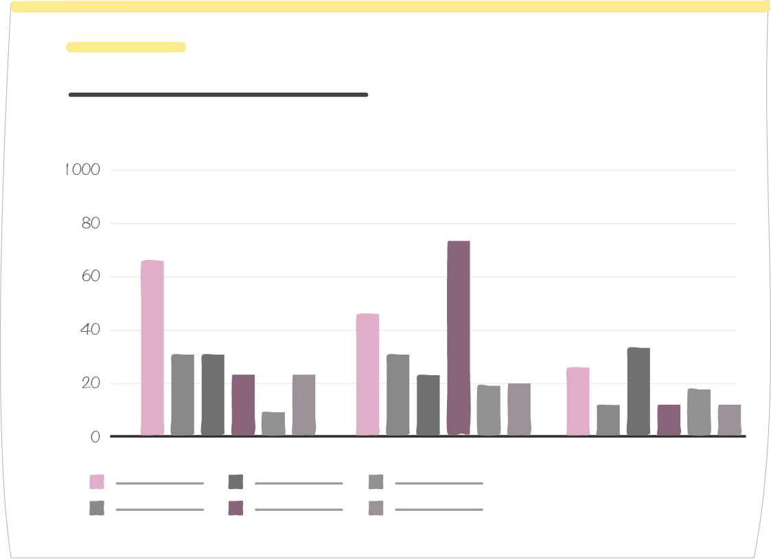
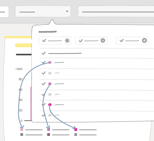
You select the indicators, circle by circle. If an indicator is belongs to several circles, in the graph it will be given different colors.
10.1. Exception of indicators included in several circles
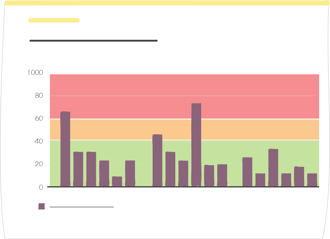
If you select several circles with the same indicator(s), by default indicators will appear several times in the graph, with the same name and the same color.
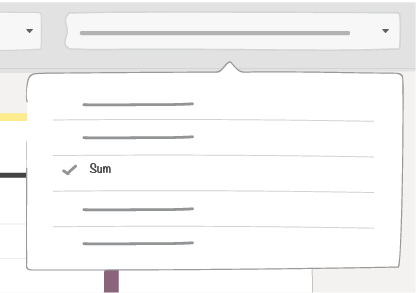
On the graph, you can then choose how to aggregate values from these indicators:
- If you choose “None” you will display a series of data (values and thresholds) by circle. Values from the first circle will keep their original indicator colors. Values from other circles will be given a color derived from their indicator original color.
- Value aggregation options: “Sum”, “Average”, “Min” and “Max” display only one series of data per indicator, with a dot for the corresponding threshold
10.2. Graph tool set up
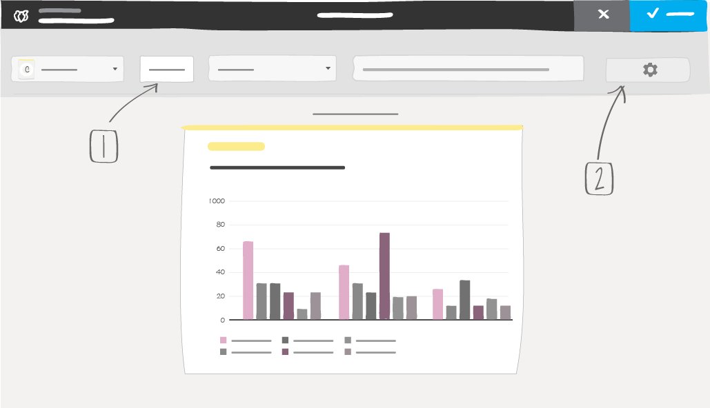
1 -> Data display set up
2 -> Graph layout
10.2.1. Data display set up
The “Set” button opens a window with a:
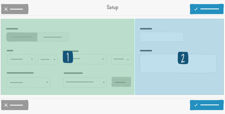
1 -> Left side
2 -> Right side
- Left side: short-term or long-term data visualisation. Long-term shows values from the letter historical data by aggregating them according to the selected option.
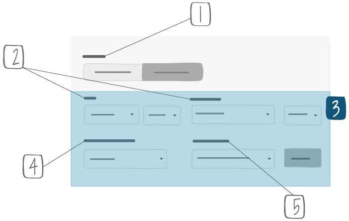
1 -> Short term tables show values from the current time window (ex.: January 2019, if we are in January 2019). Long term tables show values from a series of time windows (ex.: from January 2018 to December 2018)
2 -> Fields available for long term only
3 -> Beginning and end of long term time windows. Granularity of selection depends on board time window (ex.: a monthly board time window will allow you to select only months as a beginning or end of your long term time window)
4 -> Indicator type of consolidation : sum or average
5 -> Threshold visualization: global or by indicator
- Right side:
- A description that will appear at the top right of the item.
10.2.2. Graph layout

you can choose:
- The type of chart:
- Line chart
- Bar chart
- Stacked bar chart
- The orientation of the graph:
- Vertical
- Horizontal
Whether or not to display cumulated values under the form of line or bars.
Whether or not to display the values.
Vertical axis minimum and maximum values. By default they are automatically adapted to represented values
Whether or not to display thresholds in the background. You can use this feature to track a single indicator.
Tip
You can use this feature to track an indicator present on several cercles.