3. Configuration of QCD elements
Note
Only room administrators can access items described in this section.
3.1. Room set-up
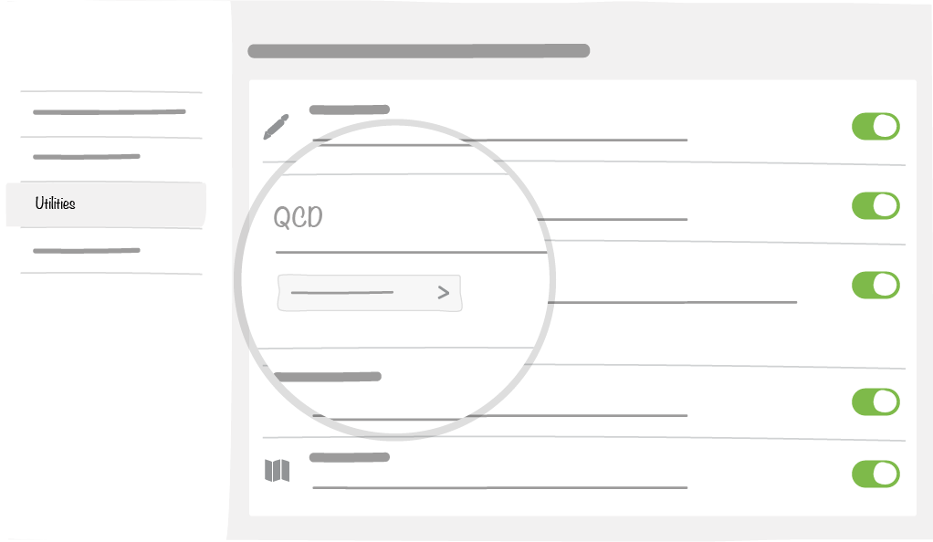
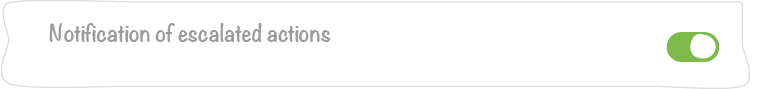
3.1.1. Escalation Notification Management
The room administrator can decide whether to have escalated actions notified or not.
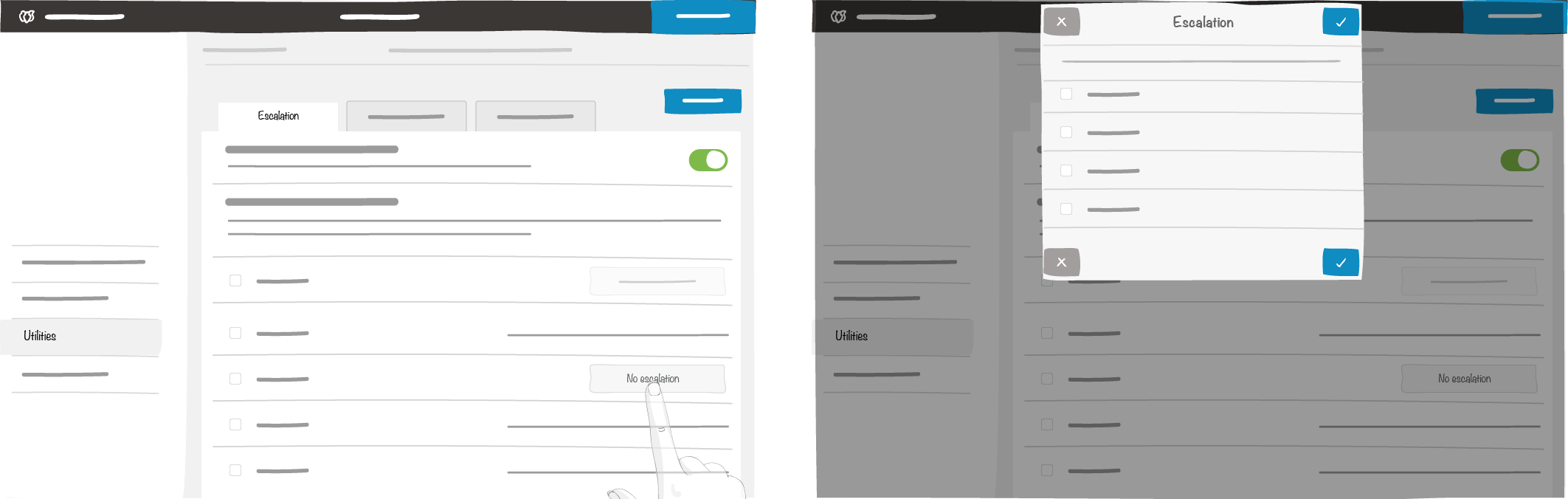
3.1.2. Escalation
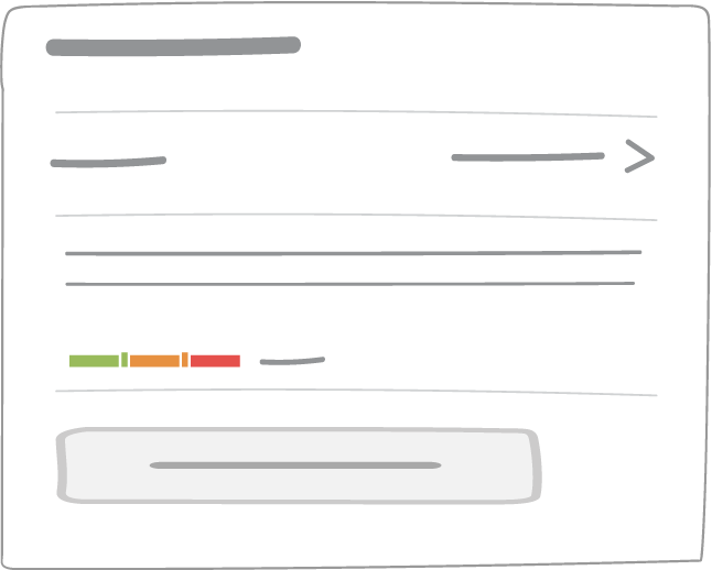
This window defines how actions are escalated in the room you are setting up. Actions are ordered by origin and type.
- All rooms accessible by the administrator are listed. You can select those you want to be able to escalate actions to, from your current room
- For each room you can escalate to, you can select the types of escalation from your current room
3.1.3. Escalation level
This list represents the types of escalations from your current room. By default, types come from the configuration file (see Platform configuration documentation).
- You can enter a maximum of 100 types of escalation per room, with a maximum of 15 characters each
- If you delete an escalation type, existing actions with that type of escalation will no longer bear it
- If you rename a type of escalation, it will be updated in all the actions escalated with that type of escalation
3.1.4. Category
This list represents the categories from your current room. By default, types come from the configuration file.
- You can add up to 200 types of problem
- If you delete a category, actions attached to this category will not be impacted.
- If you rename a category, actions attached to this category will not be impacted.
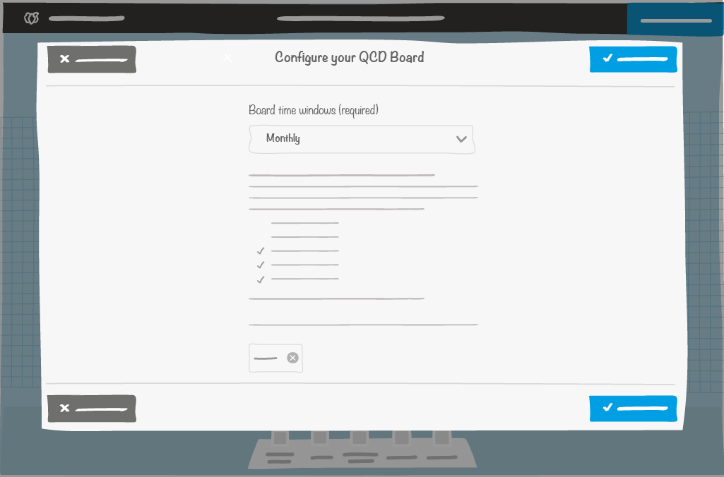
3.2. QCD Board
A QCD board is a standard board with specific properties and utilities, that must be given values after the first naming step:
- Time window
Frequency at which the board data will be stored will be referred as “historical data”
Note
A QCD board is created in the current time window. See the Historical Data Management section to find out more.
- Time window determines ritual frequencies
- See the Frequency Compatibility Matrix
- An action ID prefix
- Character string used to prefix all actions that will be created on this board
- This setting can be changed at any time, with no impact on existing actions
Note
Note: some board data are automatically deleted following actions, such as:
- Board duplication
- Creating a board template
- Creating a room template
In these cases, the following data are deleted:
- Indicator values including historical data
- Actions in letters or action card
3.2.1. Default board backgrounds
If the QCDlabel property is defined in the platform AND it points to a folder with images that follow the nomenclature described below, then the board will have a background.
| Board size | Name of the image file used for the background |
|---|---|
| Standard | <value of variable qcdLabel> _default_standard.png |
| 3A0 | <value of variable qcdLabel> _default_3A0.png |
| 4A0 | <value of variable qcdLabel> _default_4A0.png |
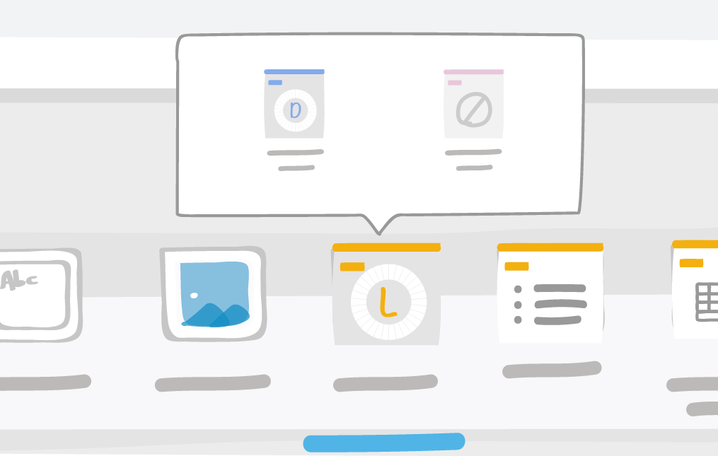
3.2.2. Default tools
When you first click on a new QCD board, 4 tools QCD tools will be available in the dock. They are named according to platform configuration.
Example:

3.3. Dock Settings
3.3.1. Setup of a QCD “letter” in the dock
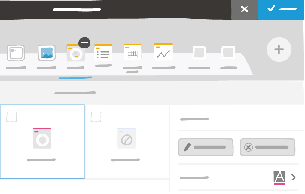
Like any other tool, in the dock you can:
- Name a letter
- Select a rendering color, which will be derived to all elements related to the letter
In addition to this basic settings, for the “QCD letter” you can set-up :
- The character that will be displayed in the middle of the rings (it’s also possible to insert, via a copy/paste for instance, almost any existing emoji; the web site emojipedia gives a good listing).
- The number of rings the letter will contain and their breakdown
3.3.1.1. Ring setup and other forms of breakdown
As a first step, you have to define the number of concentric rings of your letter, as well as their names. The maximum number of rings is 3 (also called “outer” ring, “middle” ring and “inner” ring).
Then each ring can be broken down in 2 ways
- The first type of ring breakdown is time related, as it is based on ritual frequencies (“I do my qcd ritual every day / every week / …”).
- With this type of breakdown, the ring will be divided into many boxes, whose number will be automatically generated according to the time window of the board. Their wording will also adapt automatically. Example:
- On a board with a monthly time window, a letter with a daily ritual frequency will be split into 31/30/29/28 boxes depending on the month, and its boxes will be labelled ‘1’, ‘2’, ‘3’, …
- On an annual board, a semiannual letter will be labeled ‘S1’, ‘S2’, …
- On a quarterly board, a weekly letter will be labeled ‘Wn’, ‘Wn + 1’, … depending on the quarter selected for the short term time window
- For a letter to be usable on a board, its time window and type of breakdown have to be compatible with those of the board (as a reminder, tools defined in the dock are common to the whole room). See the compatibility matrix.
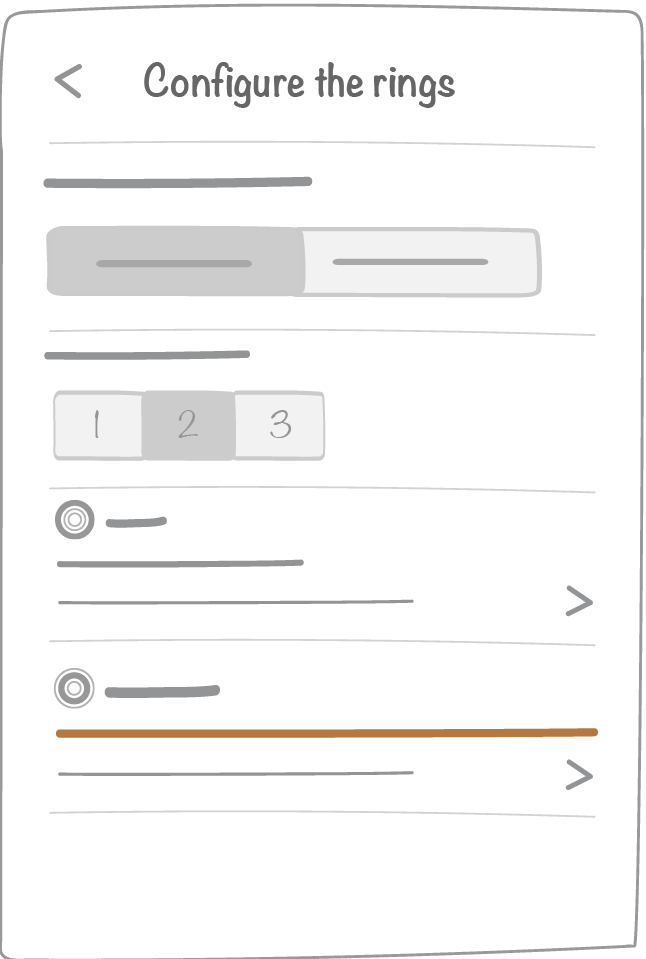
The icon in the dock will show you whether or not the letter is compatible with the time window and ritual frequency of your current board:
- The second type of breakdown is “custom” : you can manually define your ring cut-out and define box labels
- The administrator sets up the number of boxes that the letter will contain
- Users can then define box labels in the letter setup panel
3.3.2. Letter incompatibility
If a letter is not compatible with the current board (see the compatibility matrix ), it will be represented with the icon below:

3.3.3. Other QCD tools
Other QCD are not configurable. They have the same features as iObeya data visualization tools.
3.4. Letter settings
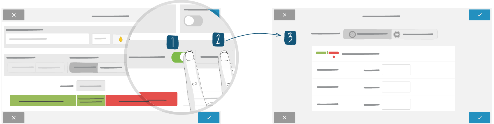
You can access a letter settings by clicking once on in it and by choosing “settings” in the menu. The administrator can change all the properties of a letter.
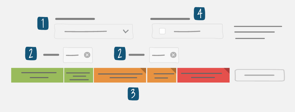
The interface is divided in 3 parts:
1- Indicator settings
2- Rings setup
3- Parameter Letter
3.4.1. Ring settings
The table below summarizes the settings for a single ring. The setup procedure is to be repeated for every ring, depending on the number of rings defined in the tool settings.
Note
You can create up to 3 rings.
| Type of breakdown | Property | Description |
|---|---|---|
| All | Text field limited to 20 characters. | Name of the ring, which we will find in the definition of the indicators, in the filters of the other tools, in the legend of the letter … |
| Time | Non-worked days
|
Automatically turns Saturday and/or Sunday boxes gray according to the current short term time window. |
| Time | Type of box color coding
|
Allows you to choose the rule for box color coding. |
| Custom | Box labels | Allows you to define the text that will appear in each box. |
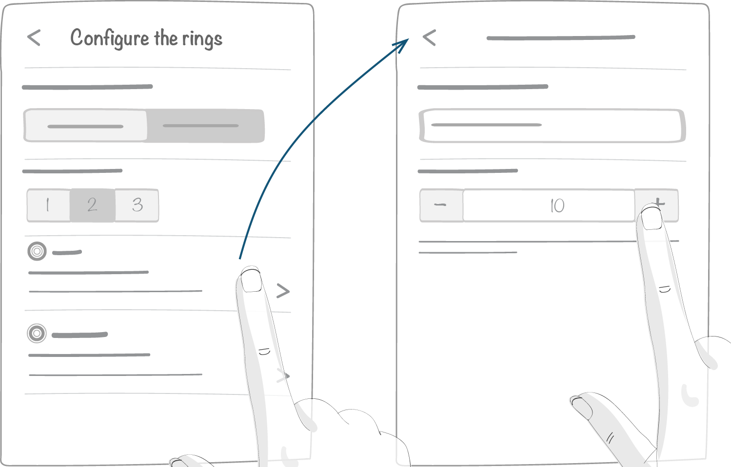
3.4.1.1. Activating a new ring
Note
This feature is only available for temporal cutout.
- From your board, click on the letter in which you want to add a ring.
- From the contextual menu, click Parameters.
- Click on Activate a new ring.
- Select a ritual frequency.
- Click Save.
Note
The ring(s) already configured cannot be moved on the letter. The new ring will automatically be added to the external side of the letter.
3.4.1.2. Showing or hiding a ring
Note
This feature is only available for temporal cutout.
- From your board, click on the letter you want to edit.
- Click on the toggle associated to the ring you want to show or to hide.
- Click Save.
3.4.1.3. Box color coding
| Element type | Definition | Example of color coding icons |
|---|---|---|
| Manual | Users manually choose the color of a box | 
|
| Single thresholds |
|
|
| Global threshold | The sum or the average of the indicators sets the box color, depending on the global threshold | 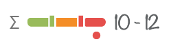
|
3.4.1.4. Manual
For each available color (depends on the Platform configuration), the administrator can specify whether the user will be prompted an action. By default, action creation pop ups are set on red.
3.4.1.5. Global threshold
For this type of color coding, you have to explicitly define a rule.
This rule is based on the following elements:
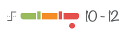
- The calculation method, that can be the sum or the average of indicator values
- 1 or 2 thresholds depending on the Platform configuration.
- The formula, that defines box color by comparing indicator sum or average to threshold(s)
- The action creation pop-up that can be triggered from a formula including all indicators or from a formula defined for a single indicator
3.4.1.6. Single thresholds
For this type of color coding, boxes will be given a color based on single rules defined for each indicator.
3.4.1.7. Color coding icons
| Ring color coding | Ring color coding icons | Indicator color coding icons |
|---|---|---|
| Manual |
The dot reminds whether an action creation pop-up rule was set up |

|
|
Action creation pop-up for local actions |


|

Action creation pop-ups are enabled. The formula and threshold will not be used. |
|
No local action creation pop-up |

“Global” action creation pop-ups are enabled. |

Action creation pop-ups are disabled. The formula and threshold will not be used. |
| By threshold (indicator) | None | 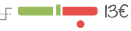
All the properties of the rules will be used. |
3.4.1.8. How to use calculation formulas
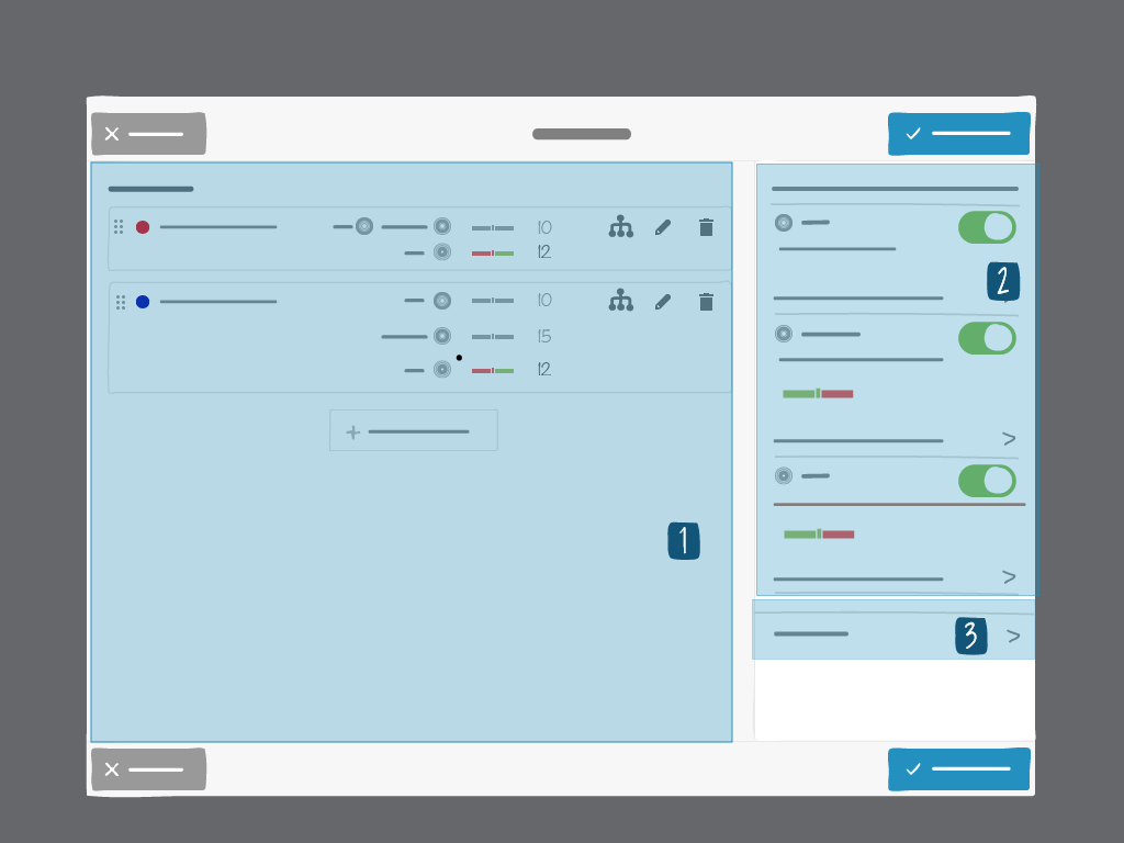
Calculation formulas allow you to define box color coding based on 1 or 2 thresholds. For 1 threshold your color code will have just 2 colors: green and red (see example below):
| By default the box is green when the value entered in the box is below the threshold. In this example we chose the default color, but we might have switched it to red instead. | 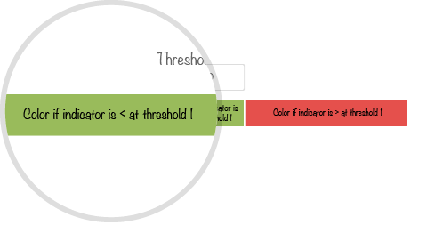
|
| By default the box is green when the value entered in the box is equal to the threshold. In this example we chose the default color, but we might have switched it to red instead. | 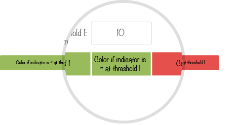
|
| By default the box is red when the value entered in the box is greater than the threshold. In this example we chose the default color, but we might have switched it to green instead. | 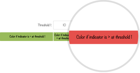
|
As shown in the example below, in the case of 2 thresholds, color coding will have 3 colors: green, red and orange. Nota: orange is to be enabled in the platform to be available.
| By default the box is green if the value entered in the box is below the lower threshold. In this example we chose the default color, but we might have switched it to red or orange instead. | 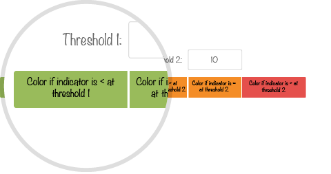
|
| By default the box is green if the value entered in the box is equal to the lower threshold. In this example we chose the default color, but we might have switched it to red or orange instead. | 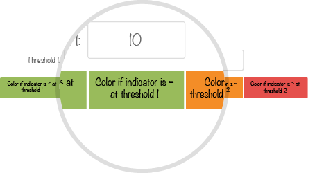
|
| By default the box is orange if the value entered is between the lower and higher thresholds. If orange is not enabled, red will be the default color. In this example we chose the default color, but we might have switched it to green or red instead. | 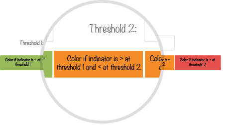
|
| By default the box is orange if the value entered is equal to the higher threshold. If orange is not enabled, red will be the default color. | 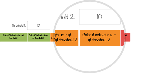
|
| By default the box is red when the value entered in the box is greater than the higher threshold. In this example we chose the default color, but we might have switched it to green or orange instead. | 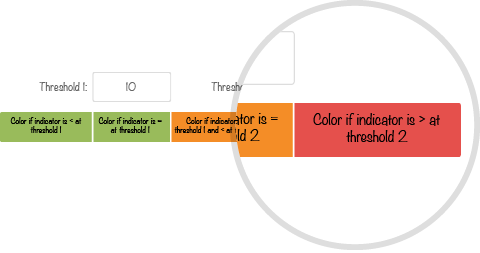
|
Note
Note: in case of two thresholds:
- The second threshold must be greater than the first threshold.
- If the first threshold is defined, then second one has to be defined as well.
You can select the color by clicking on one of the colored squares

3.4.1.9. How to use action creation pop-ups
Regardless of the type of color coding of a ring or the color of a single box, you can always set up an action creation pop-up.
- For manual color coding, you can set this up directly in the ring setup interface.
- For threshold color coding, you can define for every interval whether or not there will be an action creation pop-up. A tick will remind if the pop-up is enabled.

3.4.2. Indicator management
Indicators can be added, modified, deleted and re-arranged.
Note
Note :
The list of indicators depends on the short term time window you are in. It can therefore change depending on the short term time window you selected. By default, every time you create a new short term time window (example: January is over and you move to February), the list of indicators from the previous time window will be created in the new one. Refer to History Management for more details.
Each ring can have up to 10 different indicators.
An indicator has:
A name (40 characters maximum). Mandatory.
A color. Mandatory.
A unit of measurement (3 characters max)
A link with at least 1 ring. Mandatory.
A switch to set if the indicator is mandatory or not. Note: if a mandatory indicator is given no value, the ring it belongs to will not be color coded if its color coding type is set on Single thresholds
- A type of indicator value entry
- Threshold value entry type, with on 1 or 2 thresholds
- Binary value entry type, with the indicator bearing 2 values only
Note
Changing the State fields in the binary valuation mode only affects the button label, its value does not change.
The values used for the binary valorization mode are always 0 and 1. The value 0 is on the left.
During consolidation, only the values of the buttons (0 and 1) are used.
- At least one rule consisting of:
- If you are in a threshold value entry type
- 1 or 2 thresholds
- A formula
- a setup for action creation pop-ups corresponding to value intervals among thresholds
Note
Note :
Each ring can have its own rule, but the same rule can also be applied to all rings.
If the same threshold value applied to all the boxes of a ring does not work for you, you can now enter a threshold value for every single box
- If you are in a binary type of indicator value entry
- 2 values only, defined by a label or a color, with the corresponding action pop up
Note
Note :
- The above rule can be applied depending on the type of color coding selected for the ring:
Type of box color coding Rule applicability Manual Rule not applicable Global threshold Rule not applicable Global threshold, with “local action” enabled Rule inapplicable. Action creation pop-up applicable Single thresholds Both rule and action creation pop-ups are applicable
An indicator can become a recipient and therefore a consolidated one.
3.4.3. Parameter letter
3.4.3.1. Name of the letter
The letter name can be changed after adding it to the board. The new name appears at the top left of the letter.
Note
The letter cannot be changed once added to the board.
3.4.3.2. Group
This configuration is only available from the contextual menu of the letter.
This allows you to filter your letters by groups when using Input of indicators.
3.4.3.3. Description
A simple text field that will be displayed at the top right corner of the letter.